Website Design & Brand Presence
GRX Moto wasn’t looking for just a website; they wanted a digital presence that reflected their passion for precision and performance. Before designing anything, we immersed ourselves in their identity, analyzed their competitors, and defined a narrative that would connect emotionally with their audience. Our strategy focused on transforming their technical expertise into a strong, memorable digital experience that inspires trust.
We created a dark, elegant, and high-impact visual identity inspired by the world of motorsports and engineering. Every element, from typography to contrast to visual rhythm, was crafted to communicate power, care, and professionalism. The result is a clean, balanced, and sophisticated composition that elevates the brand and draws attention to what truly matters.
We transformed the concept into a fast, intuitive, and fully responsive website. The structure was reorganized to improve navigation, speed was optimized, and the platform was built to be flexible and scalable. We implemented strong SEO foundations and a clear layout that allows users to find what they need effortlessly.
After launch, GRX Moto saw a notable increase in engagement and trust from potential clients. We refined loading times, adjusted content based on user behavior, and optimized key elements to strengthen conversions. The final result is a digital presence that truly represents their professionalism and vision.
Website Design & Brand Presence
Ahorra Energía Asesores needed a digital presence capable of communicating trust, clarity, and expertise in an industry where customers often feel overwhelmed by technical information. We started by understanding their core mission: helping homes and businesses reduce energy costs through honest, transparent consulting.
Our strategy centered on simplifying the complex, humanizing their message, and positioning the brand as a reliable partner in energy efficiency.
We crafted a clean, modern visual identity inspired by sustainability, innovation, and transparency. A light, fresh palette and strong geometric elements were used to reflect efficiency and environmental responsibility. The design emphasizes clarity and approachability, making it easy for users to understand services, benefits, and next steps.
The final aesthetic blends professionalism with warmth, helping the brand stand out in a market full of generic and overly technical competitors.
We developed a fast, intuitive, and fully responsive website built around user-friendly navigation. Each service category was structured to reduce friction, guiding visitors toward the most relevant solutions.
Clear calls to action, optimized content, and strong SEO foundations were implemented to increase discoverability and support long-term growth. The result is a platform that informs, builds trust, and converts.
After launch, Ahorra Energía Asesores saw greater engagement and improved user interaction across the site. Visitors now spend more time exploring services, and the brand benefits from a more credible and authoritative digital presence. Ongoing optimizations focused on load performance, content refinement, and behavioral insights ensure the website evolves alongside the company’s offerings and customer needs.
BRAND DESIGN & CUSTOMER EXPERIENCE
Raíces Latin Kitchen wanted more than a standard menu redesign; they wanted a piece that captured the soul of their cuisine. We began by exploring their cultural roots, their flavor palette, and the emotional connection they wanted guests to feel. Our strategy focused on transforming the menu into a story: something that expresses heritage, warmth, and authenticity while elevating the restaurant’s overall brand experience.
We crafted a bold, vibrant menu inspired by the richness of Latin culture and the restaurant’s connection to nature and tradition. Organic shapes, natural textures, and expressive typography were used to bring personality and life to every page. The design balances elegance with authenticity, creating a visual identity that feels premium but still deeply rooted in Latin culinary heritage. Every element invites the customer to explore, discover, and engage.
We restructured the entire menu layout to make it intuitive, clear, and enjoyable to navigate. Categories were reorganized to highlight signature dishes, pricing was simplified for readability, and spacing was optimized to create a more premium, magazine-like feel. Each visual detail was carefully executed to ensure consistency across print and digital formats, turning the menu into a memorable part of the dining experience.
After launching the new menu, Raíces Latin Kitchen saw increased customer engagement and positive feedback regarding clarity, aesthetics, and overall dining experience. Guests now spend more time exploring dishes, discovering new flavors, and appreciating the story behind the brand. The menu not only functions as a practical tool but also strengthens the restaurant’s identity and enhances the emotional connection with its customers.
Website Design & Brand Presence
MS Concrete Coating was launching a brand-new business and needed a digital presence capable of establishing credibility from day one. Their goals were clear: attract students for their new epoxy training courses, create an online store for professional-grade products, and showcase their remodeling services through visually compelling presentations.
Our strategy focused on building trust, demonstrating expertise, and positioning the brand as a modern, dependable authority in concrete coating and surface restoration.
We developed a bold and contemporary visual identity inspired by industrial materials, clean geometry, and the glossy finish of epoxy. High-contrast layouts, metallic accents, and strong typography were used to communicate durability, precision, and quality. Visual storytelling played a key role: large imagery, dynamic service sections, and product highlights were crafted to engage customers instantly. The design makes the brand feel professional, modern, and fully aligned with its technical expertise.
We built a fully responsive, fast, and scalable website that seamlessly brought together the three core pillars of the business: an intuitive booking system for epoxy training courses, a complete e-commerce store for tools, kits, and materials, and a highly visual service gallery designed to showcase real transformation projects. The entire platform was structured with intuitive navigation, strong SEO foundations, and smooth conversion paths, allowing users to explore training opportunities, purchase products, or request remodeling services effortlessly and without friction.
Following the launch, MS Concrete Coating gained immediate credibility within its local market and online community. Course inquiries increased, product sales began to grow, and the service portfolio became a powerful tool for attracting remodeling clients. Ongoing optimizations ensure the site continues to evolve as the business expands, strengthening visibility, performance, and customer engagement across every section of the platform.
BRAND DESIGN & CUSTOMER EXPERIENCE
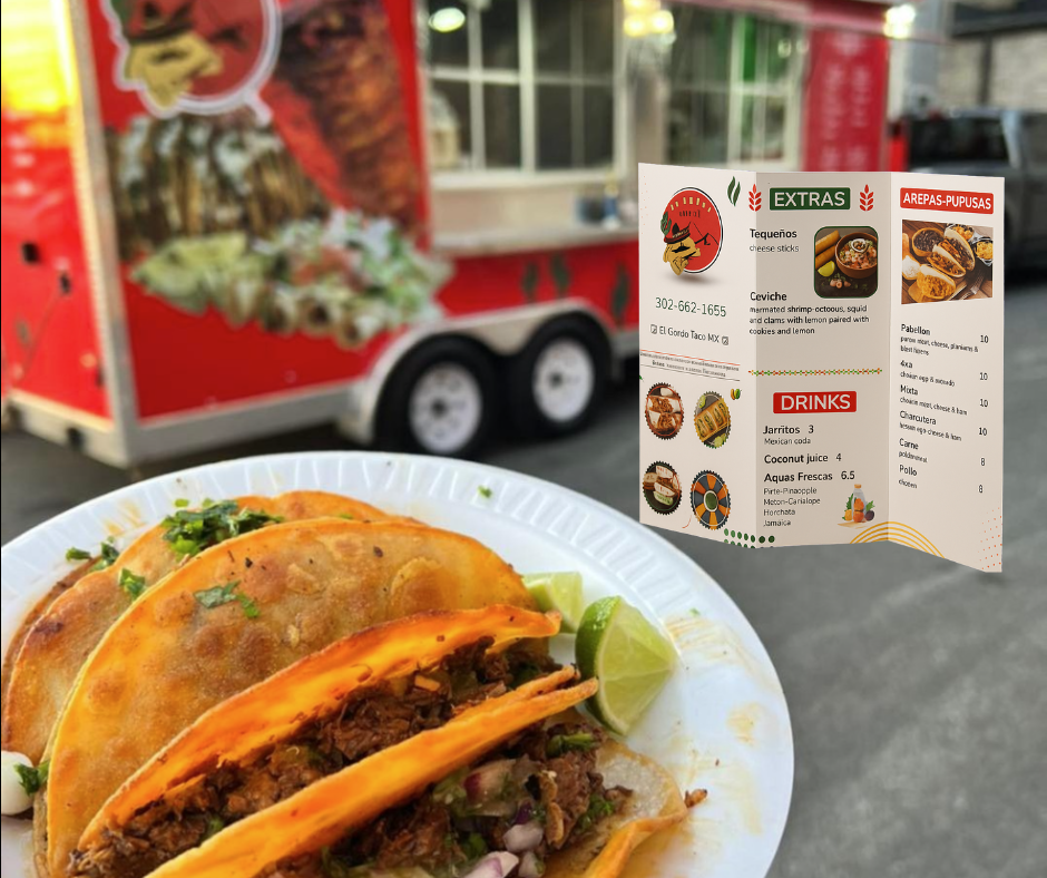
El Gordo Taco MX wanted more than a quick menu update; they were seeking a complete shift in how customers perceived their brand. Their goal was to elevate the takeout experience, signaling a higher level of quality not only in their food, but also in their overall presentation, materials, and customer touchpoints. We began by understanding the authentic flavors that define their cuisine, their loyal customer base, and the impression they wanted to leave with every order. The strategy centered on creating a menu that instantly communicated freshness, professionalism, and a step forward in the evolution of their brand.
We developed a vibrant and contemporary menu design inspired by the bold colors, textures, and personality of authentic Mexican street food. Clean structure, appetizing visuals, and a fresh color palette worked together to give the brand a more polished and modern look. Every element was designed to feel elevated yet approachable, maintaining the fun, energetic spirit of a food truck while introducing a refined and cohesive aesthetic. The final design enhances the visual appeal of every dish and reinforces a sense of upgraded quality.
We reimagined the entire layout to make the menu easy to read, visually engaging, and suitable for both digital and printed formats. Categories were reorganized to improve clarity, pricing was optimized for better readability, and imagery was integrated to highlight the food’s appeal. The materials and finishes were chosen to feel more premium, helping the menu become a true extension of the brand’s improved image. The redesign not only streamlined the customer experience but also aligned the visual identity with the food truck’s newly enhanced installations and branding materials.
After launching the new menu, El Gordo Taco MX received immediate positive feedback from customers who noticed the jump in quality. The updated design strengthened the brand’s presence, created a more professional and memorable impression, and helped elevate the perception of both their food and their service environment. The menu now plays a key role in shaping the customer experience, supporting the business’s growth and reinforcing its commitment to quality at every touchpoint.